Hello! Welcome to my latest post.
I thought it was time to share some of the ideas
I thought it was time to share some of the ideas
we came up with for our kitchen
 |
| The family kitchen |
 |
| The warm and welcoming kitchen pre renovation, wall and pantry still in |
When I first walked into the kitchen-as-was, I was struck by the lovely old Aga (not literally) and the stunning farmhouse floor. Both helped to give the room a real sense of character - it just needed a bit of updating.
The wall behind the dresser was removed to open through to a family room and eating area, the open door was blocked up creating a separate laundry with access from the family area. The brick and plaster walls with door show the pantry outline which was removed. (see below).
 |
| Bedlam - I can't believe I hung washing in the dust zone! |
We lucked out the day we found out about Bryan Grimsley, our kitchen cabinet maker. A true craftsmen, he has been making kitchens for over 40 years. If you have a good idea of layout and what you need, it is well worth trying to find an independent cabinet maker. You will cut down significantly on the designer and overhead costs charged by high street kitchen companies. Bryan is based in Banbury - please get in touch if you would like his details!
The great thing about designing your own kitchen layout is that you can create storage solutions to suit your family and lifestyle. (Yes I did have a quick tidy!).
 |
| Bryan designed this cupboard to house my Aga trays and kitchen electricals |
 |
| A jar fan! We installed this cupboard so I can see all my baking and cooking ingredients |
 |
| This large pull out drawer hides an upper draw - perfect for filling the otherwise empty space |
 |
| Our multi-function Island! |
I would suggest 1m (39 inches) is spot on between cooker and island. The island becomes a practical surface for things coming out of the oven. Any less and you might struggle for space to open the door and transfer your delicious cooking over.
If there is a counter top nearby I would suggest at least 120cm (47 inches) as a minimum space to allow people to pass each other.
For island seating the general rule is that each person needs around 55cm (approx 22 inches) width to sit on a stool comfortably alongside someone else without feeling squashed.
Clearly all this depends on the overall size of your kitchen and how you want to use it, but we found them to be useful measurements as a guideline.
In our previous home we installed an island with stools on one side. I often found myself grabbing a stool and going to the other side to chat to friends. In this house we designed an Island with two stools either side and a drop down at the end for a desk.
At the other end of the island I have a host of kitchen drawers and with the space between Bryan created two chopping boards and a large tray that slot neatly into the gap.
We chose oak for the surface of the island - because we love it visually & as a tactile surface and as a contrast to the granite on the rest of the work surfaces. Please don't be put off using wood! It is easy to take care of when sited away from taps and areas that see a lot of water. Every now and then I use the finest steel wool to gently take off surface marks, then wipe on and buff up some Liberon Finishing Oil to keep it looking its best!
 |
| Admin central at the end of the island unit |
I pinched the above idea from friends (thanks Anna and Piers!). The drop down desk is a great place to have the paperwork for the family and a phone and computer for my blogging and general admin.
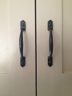
Cupboard handles were chosen to tie in with the window locks and stays. They were purchased by my kitchen maker from Hafele (link: www.hafele.co.uk) as were all the metal baskets installed in my corner cupboards and my jar pull out cupboard.
The Aga used to have a shelf above it but it was simple and plain so I enhanced by getting the builder to inset this beam we found at a local reclamation yard, to add a bit of old world character.
 |
| Oak beam reclaimed to give a rustic feel |
 |
| The Belfast sink was installed for a country character feel with traditional nickel taps |
And what about our never-ending wine storage unit? Never a dry party at our house! It was initially inspired by a need to fill some extra space but what could be better? Using oak to fashion the bottle stays has made it a real feature.
So there it is! I hope you like what we have done with our kitchen refurbishment - perhaps it has give you food for thought for your own design?
Please take a look at my other posts all about our home renovation project. I would love to hear your thoughts and comments.
Thanks, hope you visit again soon!
Lucinda


No comments:
Post a Comment
Thank you for visiting my home renovation blog. Please like and share with your friends to spread the word. I would love to hear your comments and feedback. Hope to see you back here soon! Lucinda