Thursday 24 September 2015

Fifty Shades of Grey and counting...

.... Understanding style, room orientation, light and paint colour


For some, choosing paint colour is instant.


Others (like me) collect every available sample pot, daub every wall in a rainbow of shades and end up more confused than ever.


Here's what I learned about choosing paint colour - I hope it helps!


House style

Town House style

Stylish Town kitchen

Think about the style and feel of your home. New-build / traditional/ country / town / smart / relaxed ...it will help you create a vision and give you a sense of direction.

I do bang on about them but creating a scrap book or mood board from magazines and material samples will help you build a picture of the look.

This helps build a sense of colour, theme and helps to create the all important flow throughout the house as you plan different rooms.

If you haven't done so already take a look at Pinterest for ideas posted in similar property styles. It is a great, free source of information and inspiration.

In a town house you might consider a trad-modern look using the contrast between the white tone of the woodwork and your chosen wall colour. Blue and grey tones give a sense of strength and a smart finished look. Period properties with high ceilings and strong features can really handle bold colours and contrasts.

Country kitchen 

In the country setting of our home renovation project I chose softer blends of colour and warmer off-white woodwork tones blend to with the natural stone and wood. 

By using the same colour palate in different ways and sourcing similar natural products I was aiming for a calming, country style flow to the ground floor of the property.


North, South, East or West? 


The tone and amount of natural light in a room is dependent on the orientation of your house and the size and number of windows you have in each room.

Add to this the changes in weather, season, time of day and the colour changes significantly throughout.

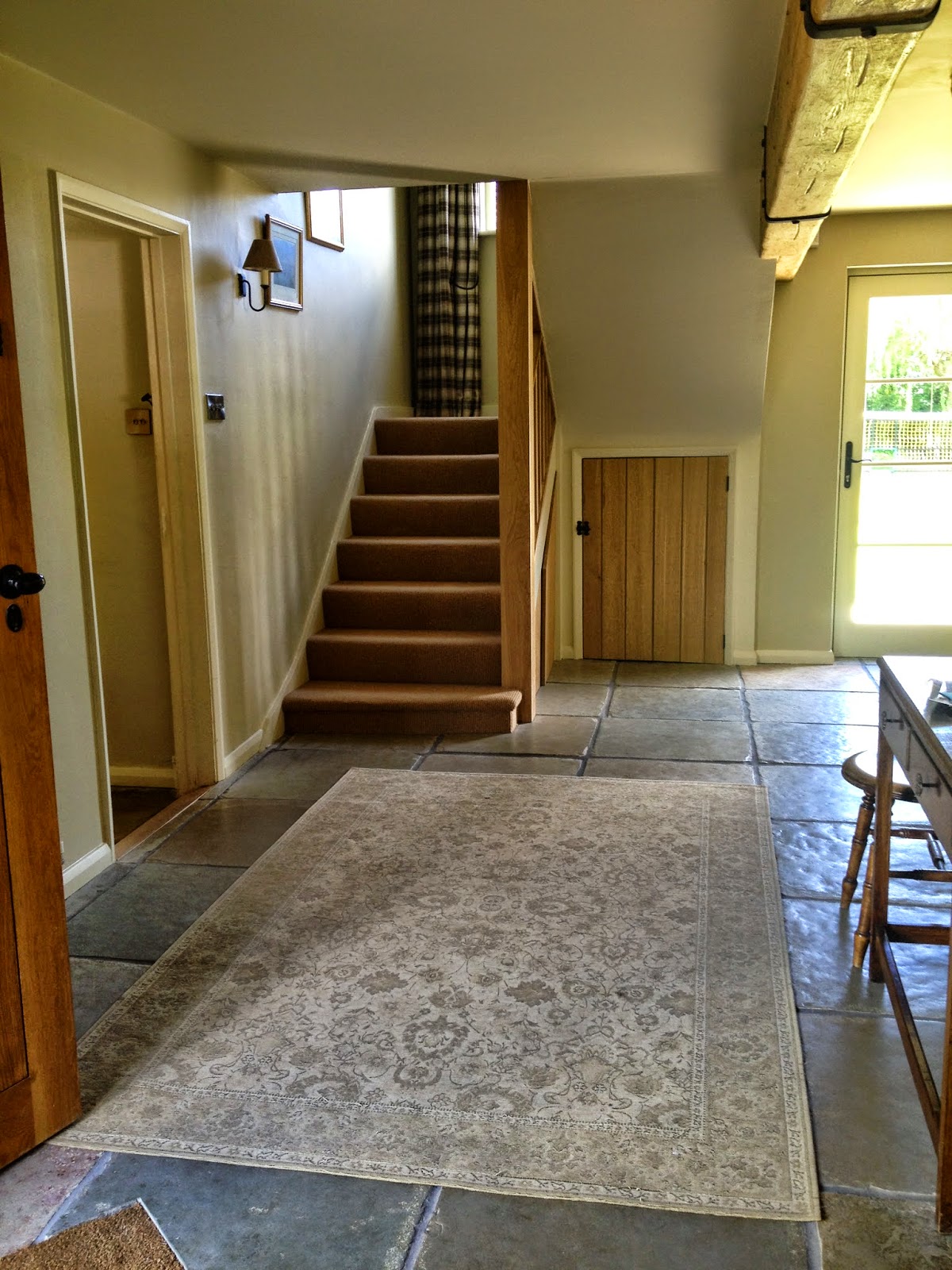
The south facing garden door and half landing window in our hall (pictured right) allow light to flood in creating shadows and changing light throughout the day.


A north facing room will naturally be a darker more dramatic room.  Rather than fighting against the shadows, using a strong shade and bold contrasts in these rooms can create impact.

This orientation will bring out the blue /grey undertones so a shade with warm undertones (yellow/red) to it will add more depth.


A south facing room will be lighter for most of the day.  If you have large windows or a lot of natural light entering the room it will significantly lighten the colour.

Most shades look good in this light and you can get away with cooler undertones as the natural light will warm them up!


The East facing room will have a blue/grey hue to it.  Trying to put warm colours in here might fight against it and create a very shaded, dull version of the colour.

Using a colour with a blue/grey undertone will work well.


West 

A west facing room will begin the day with a cooler feel to it and the colour will warm up through the day as the natural light increases.

Light colours with a warm undertone might work well in a West facing room to create a sense of warmth throughout the day.


Artificial light


As well as the natural light in a room, artificial lighting can significantly change the colour of a room. Choosing the whiter lights will cool a room down and yellow lighting will warm up the room. Think about this when choosing the tone of your lighting!


Flow

I used the colour of the kitchen units on the walls
in the sitting room to bring the room together
with a cosy snug-like feel
Creating a sense of flow throughout your house can be done by using the same light fittings, carpets, picture frames or flooring but nothing creates flow as well as the colour on the walls.

Kitchen units are same colour as sitting room walls
Consider flipping the bolder colour of the walls in one room onto the kitchen units or furniture and paint those walls in a complementary white tone.

Use the darkest colour in the palate in an alcove, kitchen Island or on a feature wall. It gives a sense of continuity as you move through the house without it being too 'samey'.


Beware! One shade difference is not enough to create a contrast; they will end up looking the same colour.  Try to leap up and down the chosen colour  palate a little.

Or what about using the colour of the wood work on the walls and painting the woodwork a wall colour in one or two rooms? This would create impact yet keep the flow.


Colour tone continues for a relaxing flow


Remember to consider the undertone (cool blue, grey or warm red and yellow) so that the tones blend.

If you love the idea of a different colour in each room you might decide to keep the undertone the same so the colours blend and do not fight eachother.


 Ok, but what is an undertone?


Each colour has a 'mass' colour - the colour you immediately see and an 'undertone' colour a shade that is almost a hue.  The undertones bring out the warmth or coolness of the mass colour.

If you look at the white shades in a colour chart you might be able to pick this out. Some will be pinky, some more yellow, some bluer and some more grey.  Using the same undertone will enhance the feeling of flow in your scheme, whereas changing the undertones will create more of a sense of difference.


 Make a room bigger or smaller  


If you want to make a room bigger, lighter colours will give a sense of space.

To make a room feel smaller darker tones will work well, perhaps focus a bold colour on one feature wall to draw the room inwards.

Painting the ceiling a stronger shade will make the ceilings seem less lofty.


Pin-pointing the colour

Swatch cards are a great initial guide to choosing the colour-way and undertone. That done, move to sample pots!

Sample pots are the next step, but you do not need to buy every shade (as I learned to my cost!).  Buy a mid range tone in a couple of colours (one warm version and one cooler as a starting point), will allow you to gauge how the undertones, colours and shades work in your own home.  You can then decide if the underlying tone is right and if you need to go lighter or darker.  


Never paint your samples directly onto the wall.  I was given this great piece of advice and it is well worth heeding. Use something like a white A2 sheet of card and paint two coats of colour. They ended up being durable and can easily be moved from room to room or wall to wall.

As already highlighted you will be amazed how the colour changes throughout the day and in different weather conditions.  In the same room a colour can look completely different if thrown into shade, on a dark cloudy day or when the lights are turned on.  Leaving the samples up and taking a look as the weather and daylight changes is important. Do not compare more than two different colour combinations at at time as they will affect one another.


*Remember, if freshly plastered a room is significantly darkened.  Paint will lift the light in the room. Consider this when holding up colour charts and samples in the room.


Woodwork

Don't forget! If you are changing the colour of your woodwork use this as an additional painted A2 sample card to compare the contrasts with wall colour.

Holding colour samples against existing white woodwork will not give you a true feel for the new look and its contrasts.


Trust your instincts - it's your home and should reflect your sense of style!  


The colours I initially liked were those I eventually selected, despite weeks of angst.

My head was turned by suggestions from friends (always well meant) and 'over thinking'.

Having a reference point to return to in terms of a mood board or scrap book helps to re-focus the mind and remind you what you are aiming to achieve.

Often the other colours and fabrics I like suited houses of a different style or overall look.  They were lovely but it didn't mean they were right for my home!

I hope what I have learned helps when choosing your colour palate!

Please ask me questions or give me feedback.  I would love to hear what you think.

Good Luck!

Lucinda 


Monday 3 August 2015

Tip-Top Work-Tops


Wooden work-tops are a worry. Will they warp with water? 

How do you keep them looking good? 

Is it a practical choice for a family kitchen?

Read on!......


Unless you are scrupulous with water spills
it can ruin a beautiful worktop

Cup stains can be eliminated and leave
your worktop looking as good as new!

Some years ago, when planning a kitchen, we visited a family who had installed stunning oak worktops. 'Don't do it!', I was told by our frazzled friends who had splashed out on surfaces that could not be splashed on!

The area around the taps was discoloured and the worktops had split down joins due to water damage. All this only a few months after the kitchen had been installed.

However, wood is a striking, beautiful and tactile finish in a kitchen, so whilst I took on board the advice not to have it near the kitchen sink or on the floor (where water damage from dishwashers or fridges can quickly ruin the look of your new kitchen), I was still keen to include it.


My premise is that a kitchen has to be practical. I am not going to worry if the wood gets a little stained or has cup ring marks as long as I can do something about it every now and again. It is a family home after all! By the same token I did not want to end up with a kitchen surface ruined by stains and warping.

My solution was to have granite worktops around the kitchen edges and use oak on the central island. As it worked so well in our last home I followed the same formula in our renovation project and I am delighted again with the result.

However, it must be stressed that wood does take a little more looking after than granite or tiled worktops so it is worth considering before installing it. In my view a little maintenance is worth the effort for the beauty of an expanse of natural wood on an island.


We have installed granite around the exterior of the kitchen
with an oak island to minimise potential water damage to the wood

So, here is how I keep my wooden worktop looking tip top!


1. Clear the work top and make sure it is clean, dust free and dry.

2. Take 00 steel wool and gently work along the grain to take off surface marks and stains.
Clear and clean the island thoroughly before using 00 steel wool
Gently work along the grain with
 00 steel wool to remove
 surface stains and mark


3. Dust the surface thoroughly.

4. The product I have been advised to use is Liberon finishing oil.  This is a natural oil for oak and in my opinion brings out the grain beautifully.

Liberon is available from
hardware stores


5. Finishing oils can be self combustable on rare occasions which means that all cloths must be washed thoroughly or disposed of carefully after use. It is nothing to worry about if handled properly, but something to be aware of. For this reason I used kitchen roll to apply the product so I can dispose of it.


6. If this is the first application of oil to a new work top you will need to layer up several thin layers as per instructions on the tin.  In this instance I use a thin paintbrush but you must be careful not to use too much and must let it soak in fully between each application. For ongoing maintenance I usually suffice with one or two coats but you can judge by the look of your worktops after each coat.


Work along the grain working the
oil into the wood


7. Begin application by pouring a small amount of oil onto the cloth (alternatively dip a paintbrush into the filled lid) or pour a small amount onto the worktop. Start spreading the oil immediately, working up and down the grain, aiming for even coverage.


8. Once the oil is applied and worked into the grain, the worktop should have a sheen but should not be overly covered in oil.  Building up thin layers is the key for the best finish.

Once oil is applied in a thin layer it should have a sheen


9. Leave to soak in for 10 minutes.

10. Using a lint free cloth buff up the surface in a circular motion with a good amount of elbow grease!  Repeat the oiling and buffing stages as necessary for ongoing maintenance but for the first application you will need at least 4 layers of oil, buffed each time.


Voila! A beautifully renewed worktop.


I hope you have enjoyed reading this post and that it helps with your decision making process! Please come back again and in the meantime let me have any comments or suggestions you have for my blog in the box below.

Thanks, Lucinda 


Sunday 28 June 2015

PROOF OF PAYMENT PANIC!

Avoid anxiety, arguing and aggravation....


It is almost a year since we added the last lick of paint to our home renovation project.

We agreed amicably with one of our trades not to pay the outstanding balance for their original works until a little 'niggle' was sorted out (not their fault) and in the meantime instructed a couple of small additional items.

What follows is a cautionary tale illustrating a fundamental issue when running your own project!:

The 'niggle' was resolved, although some time passed as we had to investigate several options to get to the bottom of the issue, again no fault of the trade. With all their work finished we asked for the final bill, expecting to owe in the region of £700.

I opened my emails to find an invoice for not £700.00 but a staggering


  £7,000.00


    PANIC! 


Unfortunately I was out when I picked up the email and not able to check my records. I carried the panic around for a few hours and as soon as I got home rushed to check it out.

From the beginning of the project I had asked each trade to sign for every cheque they picked up from us. Each payment was logged as a list on one piece of paper per trade.  It was then filed along with their invoices and original quotes.


Originally this documentation was drawn up to help me keep a keen eye on outgoing payments and cross reference it with the quotes and invoices before feeding it into the spreadsheet for the whole project.

I was able to produce proof of payment quickly. It demonstrated that the payments they believed to be outstanding had in fact been paid.  I had dates, sums of payment and their signatures alongside the receipt of payment to prove it. With the wonders of modern technology I took a picture of the document and texted it to them.

I am one of many, many clients they have looked after over the past couple of years.  They were completely genuine in their mistake but before I showed them the proof they were also adamant that I had not made the payments and the large sum was still outstanding. I had begun to question myself until I saw the proof as with so many trades and payments I could not remember exactly how much we had paid either.

This issue could have ruined the great relationship we have had for many years now, over many projects. It goes to show that without a paper trail you can have two sides who genuinely believe themselves to be in the right.  We are human and we forget things! In such instances tempers can fray quickly and relationships quickly disintegrate even ending up in court.

As the professional, honest trades they are they were happy to accept their mistake and agree that they had mislayed some of their paperwork, or forgotten to log payment as it had been some time since the start of the project. An honest mistake; I know that with no records I would have struggled to remember what we had paid them over the course of a year and a half.

So, what could have turned into a serious issue was sorted out in minutes thanks to record keeping. Following this situation I cannot stress enough how recording payments and getting your trades to sign for each payment is important it is for balancing your spreadsheets, keeping track of money going out and vital as your proof of payment.

Top Tips to Prove Payment and Preserve Peace!


1. Do not rely on your trades to remember what you have paid them.  It is your money so make it your responsibility to cover your own back and keep a note of payments!

2. Do not rely on your own memory. Even if you only have one trade, over a number of payments you will probably forget how much and when you have made them.

3. Try to use the same cheque book or bank account for paying project bills as it makes it easier to track when something goes wrong.

4. If you are managing trades yourself, create a central file for paperwork (I had a concertina one for easy filing) for easy reference and a day to day use.

5. File all paperwork immediately including copies of each quote and invoice given, whether you take them up on all of them it or not. Also include copies of any email correspondence as emails can get deleted!

6. Create your own system for recording each payment.  Each time you hand over payment record the amount, date and get your trade to sign to say it has been received.
.
7. Stick to your system.  It will fail if you are not disciplined about recording each payment.  File it immediately and don't leave until later as you might forget or lose valuable paperwork.

7. If you pay by direct debit print out the payment information and add to your documentation.  That way you have an immediate and accurate list of all payments paid out. When tallying payments at a later date you might forget about any additional transfer payments.

8. Before you make payments double check and cross reference invoices to make sure things are not paid for twice (it happened to us with something being added on two separate invoices!). This also allows you to have an ongoing tally of what you have paid to date.

Just taking these few simple steps could save you a lot of stress and leave you on good terms with your tradesmen for the next job!


I hope this post has been of use!  Please share it with your friends on Facebook or Twitter - you never know when they might need to heed our cautionary tale!

As ever, please let me have any feedback, comments or email me at : englishcountryhomeblog@gmail.com.  All images courtesy of Google.

Thanks!

Lucinda 


Monday 15 June 2015

10 Gift Ideas To Make Father's Day!


Need inspiration to find 
the perfect gift for dad? 
Read on!....


Dads everywhere will love this BarCraft Wall Mounted Crown Top Bottle Opener for an outside wall or tree - an ideal gift for the barby chef! Only £5.99. Visit the link: www.amazon.co.uk.


2


What about this smart Barbcue Tool Kit for keeping dad's barby cooking ship shape? Available from John Lewis for £59. Link: www.johnlewis.com


3


Having tasted some home-made sloe gin last year I can recommend it!

Try this Sloe Gin Making Kit from the Hand Picked Colletion, link:
www.handpickedcollection.com for £29.95


4


This beautiful  Long Olive Wood Chopping board is perfect for serving cold meats, tapas, steak, cheese or breads. Also available from  The Handpicked Collection www.handpickedcollection.com. for £29.95


5


How about this handystorage Oak Ipad holder. Great for all the home technology! From Not On The High Street £75. Link to page: www.notonthehighstreet.com


6


This fun sign is ideal for dad's shed, den or home office. The Contemporaray Home Man Cave sign £4.50 www.tch.net


7


Keep dad's beers cold this summer with this Great Beer Cooler (40cm).  Just fill with ice and beer! £18.99 Beer Cooler link to page:  www.wayfair.co.uk


8


For a practical present to save dad's back how about this sturdy Weed Puller, £35.99 by Fiskars. Available from: www.homebase.co.uk


9


For the more technically minded father what about a USB cup warmer to keep his tea or coffee warm he is surfing the net or working?  Available from: www.iwantoneofthose.com  for £5.49.


10


To keep dad's head warm while he mows the lawn what about this The Lawn Ranger beanie hat  £8.50 link: www.thegreatgiftcompany.co.uk


Whatever you choose thanks for looking at my 10 Father's Day ideas and have a wonderful Father's Day!  Please feel free to comment below with any other ideas!

Lucinda 

Friday 12 June 2015

Pull Out Your Drawers!

Hello! Welcome to my latest post. 
I thought it was time to share some of the ideas 
we came up with for our kitchen


This my favourite room in our newly refurbished home - which is fortunate for me as I spend so much time in it!


The family kitchen
The warm and welcoming kitchen  pre renovation, wall and pantry still in

When I first walked into the kitchen-as-was, I was struck by the lovely old Aga (not literally) and the stunning farmhouse floor. Both helped to give the room a real sense of character - it just needed a bit of updating.

The wall behind the dresser was removed to open through to a family room and eating area, the open door was blocked up creating a separate laundry with access from the family area. The brick and plaster walls with door show the pantry outline which was removed. (see below).

Bedlam - I can't believe I hung washing in the dust zone!


We lucked out the day we found out about Bryan Grimsley, our kitchen cabinet maker.  A true craftsmen, he has been making kitchens for over 40 years. If you have a good idea of layout and what you need, it is well worth trying to find an independent cabinet maker. You will cut down significantly on the designer and overhead costs charged by high street kitchen companies. Bryan is based in Banbury - please get in touch if you would like his details!


The great thing about designing your own kitchen layout is that you can create storage solutions to suit your family and lifestyle. (Yes I did have a quick tidy!).

Bryan designed this cupboard to house my
Aga trays and kitchen electricals

A jar fan! We installed this cupboard so I
can see all my baking and cooking ingredients


This large pull out drawer hides an upper draw - perfect for
filling the otherwise empty space

Our multi-function Island!
A key thing to consider when planning an island unit is the space between the island and the rest of the kitchen. You need to have adequate room to get food in and out of the oven with doors fully open and to pass by the island when someone is seated!

I would suggest 1m (39 inches) is spot on between cooker and island. The island becomes a practical surface for things coming out of the oven. Any less and you might struggle for space to open the door and transfer your delicious cooking over.

If there is a counter top nearby I would suggest at least 120cm (47 inches) as a minimum space to allow people to pass each other.

For island seating the general rule is that each person needs around 55cm (approx 22 inches) width to sit on a stool comfortably alongside someone else without feeling squashed.

Clearly all this depends on the overall size of your kitchen and how you want to use it, but we found them to be useful measurements as a guideline.

In our previous home we installed an island with stools on one side.  I often found myself grabbing a stool and going to the other side to chat to friends. In this house we designed an Island with two stools either side and a drop down at the end for a desk.

At the other end of the island I have a host of kitchen drawers and with the space between Bryan created two chopping boards and a large tray that slot neatly into the gap.


We chose oak for the surface of the island - because we love it visually & as a tactile surface and as a contrast to the granite on the rest of the work surfaces. Please don't be put off using wood!  It is easy to take care of when sited away from taps and areas that see a lot of water. Every now and then I use the finest steel wool to gently take off surface marks, then wipe on and buff up some Liberon Finishing Oil to keep it looking its best!


Admin central at the end of the island unit


I pinched the above idea from friends (thanks Anna and Piers!).  The drop down desk is a great place to have the paperwork for the family and a phone and computer for my blogging and general admin.

Cupboard handles were chosen to tie in with the window locks and stays. They were purchased by my kitchen maker from Hafele (link: www.hafele.co.uk) as were all the metal baskets installed in my corner cupboards and my jar pull out cupboard.


The Aga used to have a shelf above it but it was simple and plain so I enhanced by getting the builder to inset this beam we found at a local reclamation yard, to add a bit of old world character.


Oak beam reclaimed to give a rustic feel


The Belfast sink was installed for a country character feel
with traditional nickel taps

And what about our never-ending wine storage unit? Never a dry party at our house! It was initially inspired by a need to fill some extra space but what could be better? Using oak to fashion the bottle stays has made it a real feature.


So there it is!  I hope you like what we have done with our kitchen refurbishment  - perhaps it has give you food for thought for your own design?

Please take a look at my other posts all about our home renovation project. I would love to hear your thoughts and comments.

Thanks, hope you visit again soon!

Lucinda